Today, we’re going to give you a behind the scenes look at something we take pretty seriously at Broad River Rehab: forecasting.
We use several techniques to help us forecast, but today we’ll focus on just one example: forecasting COVID-19 using Monte Carlo analysis. For those who know me personally, you’ve probably heard me talk about how powerful Monte Carlo can be. If you don’t know what Monte Carlo simulations are, this page explains it for beginners. (Note: if you lost a loved one to COVID-19, I’m sorry for your loss. I am going to discuss COVID data as if it’s just data and not human lives. If that is going to be upsetting, please skip this post. ~jce)
This forecast was done in December of 2020. That’s actually been a very long time ago in terms of COVID-19 news so let me set the stage. At the time we created our forecast model:
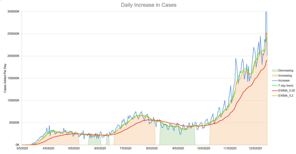
- We had entered a third “surge” or wave of cases, presumably due to Thanksgiving gatherings. New cases were higher than they’d ever been. (See image) In the United States we were adding more than 200,000 new cases per day.
- The Pfizer vaccine had been approved for emergency usage about a week prior but almost no doses had been administered yet. Additionally, there was almost no tracking about administered doses available to the public. The efficacy of the vaccine was a topic of debate.
- There wasn’t much talk about variants at this time. It was a concern, but the original variant was so effectively moving through the population that it just wasn’t the most pressing issue.
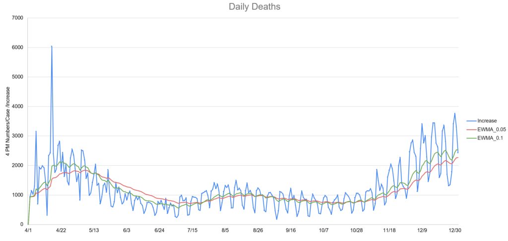
- Deaths lagged cases by about two weeks. This fact made the news about the increases in cases feel much worse. Each time we set a record for cases, the implication was deaths would follow in about two weeks. (see image)
In short, heading into Christmas 2020, there wasn’t much good news on the COVID front. In addition, “COVID fatigue” was setting in for many. That is, the tendency to not follow the recommended guidelines because many were just tired of doing so and some believed it didn’t help anyway.
Why Bother Forecasting?
If you know me then you know the answer to this is like asking the sun why it shines but there are other reasons as well:
- Having an idea when the pandemic might end is valuable business information for planning. (Estimating PPE expense, planning messaging for the company and customers, etc.) Essentially this forecast can inform other forecasts.
- Forecasting is like practicing: the more we do it, the better we get. This is especially true when you are willing to look at your forecast after the fact and honestly evaluate how you did. (Spoiler alert: we do this and it can be humbling but also educational.)
- In this particular case, the forecast might provide hope and encouragement to people who are working very hard under difficult conditions with no end in sight. As an engineer, not directly involved in clinical care, this felt like a small way to help.
How Do You Build a Model?
This part takes some creativity. In this case, we first decided what we wanted to predict and the major variables we believe are driving the process. In this case, we wanted to predict:
- The number of new cases reported daily. This is an unreliable number because not everyone gets sick enough to get tested. Some get pretty sick but don’t bother testing. Some people get tested routinely because of their jobs even without symptoms.
- The number of new deaths reported daily. This number is slightly more reliable, but also has problems. Three different states decided to “adjust” their death tolls upward to cover “presumed COVID deaths”. As you might expect, this doesn’t help with modeling.
The variables we modeled that we believed to be drivers of cases and subsequently deaths, were:
- How transmissible the virus actually is: This is not the ‘R value’ you might have heard about. In fact, I’m not a virologist or epidemiologist. This is a common sense number that essentially says “Given how many people are in the US are susceptible and how many are currently infectious, how many new cases should we expect to see?” For the more math-minded, this number is jointly proportional and was derived from the idea of the SIR model.
- The volume of vaccine administration: This was a major challenge since production, delivery and the public’s hesitancy to take a vaccine using new technology and approved for emergency use was all brand new in modern times. It was further complicated by the fact that we expected Moderna and Johnson and Johnson vaccines to be approved for emergency usage but we didn’t really know when. That means there is huge uncertainty in our confidence around the volume.
- The efficacy of the vaccine(s): At that point in December, all we were hearing was 94% effective. Given the relatively small sample size, it was assumed this number would drop once the vaccine was widely available.
- The death rate: This was another moving target. The death rate was slowly dropping as doctors figured out ways to treat more effectively. At the same time, the virus had already moved through a lot of the most vulnerable and younger, healthier people were getting sick. The two week lag made analysis difficult too.
Next comes the hard part: estimating the likely value and standard deviation for all your variables. It’s also the beauty of the this type of modeling: at this point we’re debating a much smaller piece of the puzzle. We might even build another model to help us figure this out. For some variables, effective transmission rate for example, we had plenty of data to study. For other variables, it was much more difficult.
In the case of the vaccine administration, we ended up with several different estimates based on the expected emergency approval dates and volume estimates. Much of this information came from large investment firms that are very interested in this type of information for investment purposes. Unsurprisingly, this added a lot of variation to the model output.
Build a Model
Now the fun part: build a mathematical model that you can run thousands of times. You can use Excel for this and sometimes we do, but in this cases we used a traditional programming language. We did thousands of simulations and then created a second program to analyze those results.
All of your assumptions and unknowns now turn into a prediction. Based on thousands of runs, you average together or take the most likely result. In our case, the most likely trajectory for daily cases looked like this:
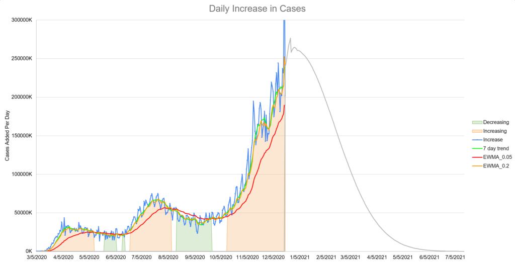
The prediction that appeared the most often was that the number of daily cases would increase greatly for another month or so and then begin a dramatic decline. Remember that at this time, no one was predicting much of anything and certainly not something relatively optimistic like this. Our model’s prediction for deaths looked similar but with a two week lag.
I’ll say there was some quiet skepticism. The poor testing and reporting around the holiday period didn’t help. It added significant noise to the data which obscured the model predictions.
However by mid-January, we were starting to see some signs that the data was matching the model. The prediction for the decline in deaths was accurate as well.
Here’s the model versus actual as of mid-June 2021:
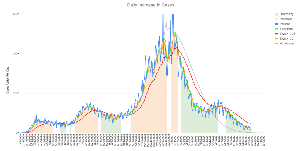
The gray line is the model’s median prediction. The jagged blue line is the number of reported cases for each day. The other three lines are different types of averages. You can learn several things from this chart:
- This model is now 6 months old and has not been updated since December 19th, 2020. I think it did a reasonably good job predicting, given the difficulty of the job.
- We missed the exact date of the decline slightly, but predicted the slope of the decline exactly.
- We did not predict the “mini-spike” that occurred in April 2021. I don’t feel too bad about this. This could be due to variants or changes in behaviors and attitudes that couldn’t reasonably be predicted in December.
- The long tail is probably going to be longer than the model predicts. This could be due to variants, test accuracy and several other things.
The model predicted the deaths well. In fact, the model’s prediction of the averaged death rates is almost perfect.
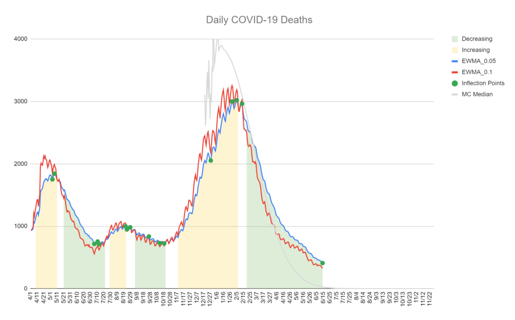
Note that we have the same issue with the long tail. Also note that the mini-spike in April had essentially no effect on the deaths.
Review Your Performance
This is the most important step. What could we have done better? What did we miss? What assumptions did we make that weren’t correct?
In the case of this model, we learned:
- The “two weeks” between infection and likely death is pure myth. This number should have been modeled with a random variable and should probably have improvement built in.
- The model should have handled long tails better. This one I knew as soon as I saw the first output. Most natural processes don’t end as abruptly as this model predicted. This is a hard problem to correct however.
- Predicting vaccine administration is difficult. The time-based model with randomness built in performed well. This is a technique we could use in the future.
We don’t normally publish internal research and probably won’t make a habit of it. We chose to in this case because hopefully the pandemic is a once in a lifetime event and we thought some might find it interesting and or useful.
Monte Carlo is a powerful technique we use often for things like modeling reimbursement and Medicaid case-mix. If you want help in that department, please let us know.