Medicare Part A patients are coveted in long-term care. Today we’ re going to look at things that are correlated with getting Medicare Part A transfers from inpatient facilities to skilled nursing facilities. We’ll start by looking at some general attributes that are correlated with lots of Med A admissions and then we’ll move to analyzing a couple of individual markets and talk about techniques and strategies to help drive your Part A census.
We’ll use 4 datasets for this analysis. First we need demographic information about every hospital and SNF so we downloaded all the data behind nursing home compare (care compare) and hospital compare. These databases give us things like star ratings, types of facilities (profit versus non-profit, ownership, etc), in addition to the demographics. We’re also using RESDAC data which gives us records of every admission and discharge to each inpatient and skilled nursing facility.
What are we tracking?
First we need to figure out what we’re tracking. At first you’d think we’d just look at the number of Med A admissions to SNFs. The problem with that is we need to control for the number of beds in a SNF. Otherwise we’d just see a strong correlation between large SNFs and admissions. The simplest way to do this is to take the number of admissions and divide by the number of beds.
Intuitively, this makes sense. If you have 100 beds and you get 100 Part A admissions, you’d get 1.0. If you had 50 admissions, you’d get 0.50, etc.
Now that we have our metric, let’s get started.
Star Ratings
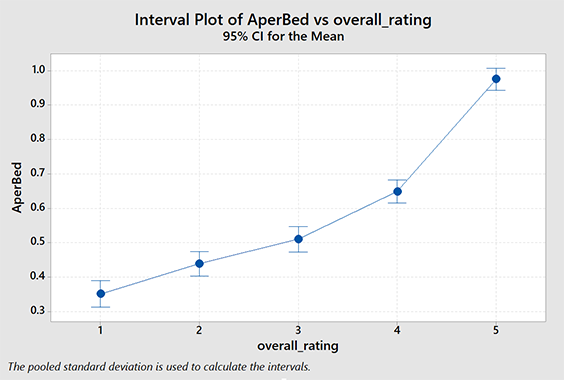
Do higher star ratings in the SNF correlate with more Med A admissions? Can we quantify it? Let’s look. This one is actually very easy. We simply do ANOVA on the star ratings versus our tracking metric. Some of you are probably wondering why I didn’t just use linear regression analysis. Star ratings are ordinal, not metric. You can’t get 2.5 stars. If you don’t know what that means don’t worry about it.
As you can see, there is a positive correlation between overall star rating and Part A admissions. The relationship is significant. You probably suspected this intuitively but we can actually quantify it using this data.
| Lower Rated SNF | |||||
|---|---|---|---|---|---|
| ★ | ★★ | ★★★ | ★★★★ | ||
| Higher-Rated SNF |
★★ | 9 | |||
| ★★★ | 16 | 7 | |||
| ★★★★ | 30 | 21 | 14 | ||
| ★★★★★ | 62 | 54 | 47 | 33 | |
How many more Med A admissions would you expect between two SNFs, both 100 beds, but with different star ratings?
This table shows you the average difference in Med A admissions in six months due to differences in star ratings for a hypothetical 100 bed SNF.
A caveat here: Does this mean that if you manage to get a better survey and increase your overall star rating from 3 to 5 you should expect to see 47 additional Med A admissions? No, not likely. There are a lot of factors influencing those admissions. The take-away from this is: star ratings are generally positively correlated with Part A admissions. The higher your star rating, the more Part A admissions you tend to have. Obviously there are plenty of exceptions to this. (See Med A Census Navigator in the app stores.) So patients and/or discharge planners are looking at the star ratings. That’s the purpose of the system and it seems to be happening.
Distance to Hospital
How much does it matter if you aren’t the closest SNF to the hospital? This is actually a very difficult question to answer. We can easily measure the distance between the inpatient facility and the SNF but the closest SNF to one hospital might be 0.5 miles and the closest SNF to another might be 25 miles. In other words, what’s distant for some is close for others.
One way to get around this problem is to rank the SNFs by their distance. The closest SNF is rank 1, the second closest is rank 2 and so on. This has several problems of it’s own, notably when two SNFs are so close that they are effectively the same practical distance to travel, one still gets ranked better than the other.
A more important problem is that we can’t use the same metric for measurement. MedAAdmissions / Beds is valid when looking at the SNF as a whole, but not when we’re looking at the relationship between an individual SNF and an inpatient facility. (SNFs get admissions from multiple inpatient facilities.) For this analysis we’ll still use the number of transfers divided by the number of SNF beds, but we won’t be able to compare this (easily) to our analysis with star ratings.
As you can probably tell, this got complicated quickly. Suffice to say, it’s computationally intensive too. I need to calculate the rank between every inpatient facility (~6,840) and every SNF (~15,500). That’s more than 104 million calculations before we can even get started.
So you can imagine my joy when I did all that work and found… really no strong correlation at all. It turns out that distance is a terrible predictor of SNF discharge location. Take-away: People will drive past a SNF with a low star rating to get to a more distance, better-rated SNF.
From Macro to Micro
So even after we account for the correlation between star ratings and Part A admissions and come to terms with the fact that location isn’t that important, guess what? Star ratings, while important, explain less than 5% of the variability in discharge locations. To really understand what’s driving the Part A flow of patients, you have to study the local market.
Example – Knoxville, Tennessee
Take a look at the diagram on the right. (Subscribers: you may want to read this on the website to see this graphic properly.)
(To read this chart, hospitals are on the left, SNFs are on the right. The ribbons represent the number of patients flowing from hospital to SNF. )
Notice that NHC Healthcare, Farragut (NHCF) is by far the largest receiver of Part A admissions from several of the area hospitals. It isn’t closest to any of the hospitals and is a 2 star facility. (This isn’t a critique of NHC Healthcare, Farragut in any way.)
So what is it about NHCF that is working so well? To begin to understand it, we need to look to the hospitals first.
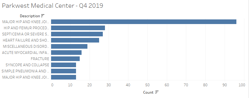
Let’s take a look at Parkwest Medical Center.
Parkwest Medical Center
Parkwest Medical Center is a major source of admissions for Knoxville area SNFs. Below we can see 10 largest categories of DRG codes discharged. This would be a good place to start our analysis. From a skilled nursing perspective, we can tell the programs we need to have in place by the DRG codes of our hospital customers.
Parkwest performed nearly 100 hip and knee replacements in Q4 of 2019. Of those, 50% went to Wellpark at Shannondale and 24% went to NHC Healthcare Farragut.
At this point you should be asking yourself, “Do we have the programs that fit the needs of our local hospitals?” “Do the hospitals know we have those programs?” “Does the community know we have those programs?”
You could also consider developing a ‘niche’ program based on studying the DRG lists of local hospitals. Specialization may be a good strategy. (Note: nationwide, septicemia is the number one hospital discharge DRG. Everyone should have a program and a marketing plan for septicemia.)
We’re essentially just scratching the surface on the analysis we can do here. The point is there are things you can and should be doing to make sure you are specifically addressing the needs of your community. Once that work is done, it’s critical that you develop and execute a plan to let everyone know you understand your market and you are prepared to serve it. You just might see a few more admissions.
One last thing I’ll add: a LOT of this data is available for free in our app, Med A Census Navigator. Check it out.